xhtml/css: April 2008 Archives

Rad Web Design Studio

| | TrackBacks (0)

It has been a week since the home page was redesigned .. with a new table-less layout. Have you gotten used to it yet? Like it? (I'm diggin' it.) Been making slight tweaks here and there...

.. such as adding left-padding to the graphics in the center section, to keep text from butting up against images.

Dreamweaver CS3: The MIssing ManualThis padding also adds a slight indent (6 pixels) to the yellow tri-blade radiation symbols which begin each post.

Speaking of design .. I got a call from somebody saying they wanted to hire me to redesign their web site. (Cool.) My nuclear training instilled in me the notion that I need to know everything about everything before doing anything professionally.

Which might be true in the nuclear world, but friends say that ain't how the real world works, and that I already know more than enough to do web design professionally.

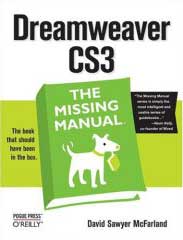
And I must admit, after reading (studying) those excellent books (» Head First XHTML/CSS, » CSS Mastery & » Dreamweaver: The Missing Manual), I *do* feel comfortable wielding web design mojo.

So if you know somebody who needs web work, I'm available. (And cheap.) I don't know PHP yet, but that's coming. Rad Web Design .. has a nice ring, no?

Note: today's entry applies to the site home page (not this blog entry page).

Notice anything different? The old/previous design was based on pre-XHTML standards mark-up .. which I had *converted* to XHTML-valid (using Dreamweaver). But the guts still contained a table-based layout (kludge).

The layout of this page however, is not based on tables (rather » on CSS). My new CSS page (if you're interested) is aqui » radified_xhtml2.css.

Been meaning to start over from scratch and layout this page based on CSS .. ever since I started upgrading my web design skills.

Now that the site is busy enough to require a VPS, I figure we probably oughta have a homepage laid-out with CSS. (Modern.)

So I finally just put my head down and went for it. Spur-of-the-moment decision. More involved than I expected. A million little details required attention .. in order to massage current content (you see here) into the new layout. And once I start a project like this, I don't like to stop until it's done. (Worked 'til 1AM.)

This CSS-based layout will let me tweak the design more easily as my CSS skills (continue to) develop.

I chose that bluish-green color (sidebars) cuz I was searching for a link-color that doesn't distract from reading this normal gray text.

The old light-blue links I was using before were so bright (on a black background) they jumped out .. which I found distracting, since I tend to use copious linkage. (Design should complement content .. not overpower it, right?) But sometimes we don't notice things, until we're looking for them. My design-aim was/is to present a content-focused website.

About this Archive

This page is a archive of entries in the xhtml/css category from April 2008.

xhtml/css: September 2008 is the next archive.

Find recent content on the main index or look in the archives to find all content.