Recently in website Category

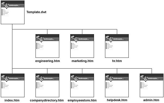
Happy Halloween. I modified the method of placing the graphics in the header found at the top of the home page .. up where it says » RADIFIED | Nuclear Grade Technolust. There I implemented a technique known as » CSS Image Replacement, of which there exist many variations, each with its own set of pro's & con's.

HalloweenThe dividing-line among web designers seems to be whether or not to use a non-semantic span tag with CSS positioning, which involves a more complicated technique .. but leaves visible TEXT in place for visitors who surf the Web with STYLES turned off (primarily those using mobile devices).

I used a simpler IR technique, by changing the images you see displayed there .. from foreground images to background images.

This allowed me to replace the foreground images (contained in those heading elements) with TEXT .. which I then indented (way to your left), so it can't be seen. By moving the TEXT out of the way, this technique reveals the graphics (.. which look prettier than standard heading-text).

The advantage however, is » devices that don't render styles (such as screen readers and mobile devices) will now see a TEXT heading and tag-line displayed there, where before there existed only images. Search engines also gives more weight to TEXT than images.

Most Rad visitors will never notice the difference .. seeing most who frequent the site (fellow technolusters) browse with both images and CSS turned ON. But I'm gradually filling my webmaster toolkit with increasingly sophisticated techniques. (Learning by doing.)

After all the pages are styled however, and the markup is coded semantically, there's still no substitute for insightful content .. that is well written (.. and hopefully seasoned with a dash of personality).

This has always been the most difficult challenge .. because a stylish suit does not a charming pig make. And the ugliest person can say the profoundest things, and possess scintillating ideas. So it would seem that content trumps style .. no matter the venue (.. except maybe for those who focus on style).

Reblog this post [with Zemanta]

Changed the underlying markup that controls the links in the blue-green sidebars on the home-page. They were previously coded as » paragraphs. I changed them to » list-items .. cuz that's what they are » a list of items (links) grouped according to category. Certainly not paragraphs .. not even sentences.

Website InspectionIf I did this correctly, you shouldn't notice any difference. Cuz I applied the same styling to the list items .. tho this was trickier than it might sound. I nearly freaked when a single misplaced comma trashed my whole layout. Yikes!

This change represents a semantic improvement. Semantics (i.e. » 'meaning') is one of the buzz-words kicked around when thinkers discuss the Web's future.

Most surprising was that it took me so long to realize I had coded the home-page with semantically incorrect markup. It suddenly hit me (last night), when out of the blue (actually » blue-green), I thought » "Those links aren't paragraphs; they're a LIST."

Reblog this post [with Zemanta]

Enrolled in Amazon's Affiliate program, something I probably shoulda done years ago. They claim it takes ~3 days to process an application, but I received my acceptance letter today. (Applied late last night.)

Crime and Punishment

Being a n00b, I don't know much about their program yet, except that they pay a percentage whenever a visitor clicks a link on my site and makes a corresponding purchase. (How big of a percentage I'm not sure.)

I've long included links to books at the Amazon site [ in pages such as this one » Best Books for Learning the Basics of Web Site Design (XHTML & CSS), and this one » Andy Budd's Book: CSS Mastery ] without ever taking advantage of their program.

If I start making considerable cash, I'll be bummed that I didn't enroll sooner. And if I don't (earn cash), I'll be bummed too, for wasting my time with this program. So either way .. which might be why I hesitated so long.

What I like best about the Amazon program is that it allows me to monetize the site without including visible ads (.. unlike Google's AdSense program). All I need to do is add the following code to the end of each Amazon link » ?ie=UTF8&tag=radifiedcom-20. So it's virtually invisible to visitors. If I didn't tell you, you might never know.

I also like that it doesn't cost visitors anything extra when purchasing a book via a link from this site.

After establishing an 'Associate' account (and logging in to the Amazon site), a toolbar magically appears at the top of the browser window whenever I visit Amazon.com.

The Associate toolbar allows me to create targeted links to the particular book/page I'm at/on .. with a single click. Couldn't be easier. I simply paste the auto-generated code into my web page.

Reblog this post [with Zemanta]

Changed the type of layout I use on the home page .. to » LIQUID-ELASTIC hybrid. If I did this correctly, you shouldn't notice any difference .. unless you change your default text-size (.. by selecting 'Text Size' from the 'View' menu in IE). Lemme know if you notice any display quirks.

Liquid CSS Web Design LayoutThere are 4 different 'types' of layout designs:

  1. FIXED (column widths remain fixed, no matter what, used » here)
  2. ELASTIC (column widths change with changes to your preferred font-size)
  3. LIQUID (column widths change with changes to browser-window sizing, used » here)
  4. HYBRID (combination of two or more of the above, used »  here)

I've long preferred LIQUID layouts (sometimes called » FLUID), which resize column widths as you resize your browser window (called the "viewport" by those in the biz). It's easier for me to understand the concept behind LIQUID layouts .. than ELASTIC.

Today however, I'm demo'ing a » HYBRID layout .. that combines elements of both LIQUID & ELASTIC. [ If you've read my SCSI guide, you know I'm a fan of hybrid config's. ]

The center section/column remains » LIQUID, while the two sidebars (blue-green colums) are now » ELASTIC. This means they will resize with changes made to your preferred font-size (e.g. » small, medium, large, gigantic, etc.). The center section will continue to change proportionally, as you resize your browser window - just like before.

Resizing your browser window will no longer affect the width of the blue-green sidebars (which are already skinny), while changing your default font-size will not affect the width of the center column/section.

The design itself of the home page has remained unchanged. Only the 'type' of layout has been modified (.. from LIQUID to » LIQUID-ELASTIC hybrid). This new type of page layout is considered more 'accessible' ..

.. especially for those who might have difficulty reading smaller text, and need to bump up their default font-size.

Been working on the Rad guide to Drive Imaging & Disk Cloning. Helps to be up-to-speed on Web Page Templates. Makes that part of it go more smoothly.

Digital sleepI endeavor to work on it a little every day, tho it never works like that. Yet when I focus, I'm able to put my head down & plow.

The guide seems to have a mind of its own .. like it knows how it wants to turn out. So I go with the flow, prepared to lay aside preconceived notions.

I would hope all Rad regulars are already onboard with a backup program .. since creating backup images with a Cloning program is what we do here.

Back when I investigated how to create a webpage template, a couple weeks ago, I really had in mind the notion of using a template as the basis for a new Rad guide .. not one on Dreamweaver Templates however, but rather one for » Drive Imaging & Disk Cloning. Today I created that template, and began a new Rad guide.

Hard disk drive internals Definitely takes longer to get up-n-running when using a template, cuz you first must determine exactly how the guide will be structured .. and what items to include in the template, and what parts need to be editable.

Can't just start cranking out pages of text and entertaining new ideas (.. like I used to) .. leaving the details of page structure to deal with later.

Templates force you to pre-think everything up front, before you begin generating content-one. They even force you to anticipate changes .. which is new for me .. especially since I've grown accustomed to the ready-fire-aim approach, which leaves the details of page structure for later .. but by then it's difficult to make changes .. cuz each page must be edited individually (.. hence the need for templates).

I was so eager to get started on the guide that I actually had to start over (several times) .. due to major template modifications. (Arrgh!) Kept getting new ideas .. things I wanted to add/tweak.

You can always modify a template, as that's what they are designed for. But when a template requires many edits, it seems easier to just start over and create a new one. (Something I'm getting good at .. from all the practice.)

It occurred to me again today, while composing a short thank-you note, that Texans donate more to the Rad cause (this site) than all other states combined.

TexasNever been ever to figure out this statistical curio, seeing I live in California.

I've lived in many states over the years .. including Connecticut (where I grew up), Florida, (where I attended both bootcamp & the Navy's Nuclear Power school), Maine (shipyard at Bath Iron Works), Hawaii (the first state away from home to feel like home), Idaho (gorgeous .. in the summer), Washington, Pennsylvania & Illinois, and vacationed in many others, but Texas isn't one of them ..

.. tho I do recall being enchanted with the sense of expanse there as I drove thru the panhandle on I-40 (on my way to California). There was something compelling about the landscape .. readily apparent soon as we crossed the border. Vast & open. Felt like I could see for a hundred miles. Couldn't stop looking, as if it were beckoning.

So maybe Texans are simply the most generous?

Anyway, thanks to all you Texans for your continued generosity over the years .. especially during these difficult economic times, when so many are struggling financially. I'm sincerely grateful.

While surfing the web recently, I've noticed more website authors including a photograph of themselves on their home page (.. places such as here & here) .. aka 'mugshots'.

Mug ShotI forget when I added it, but my mugshot has been posted there for quite some time. It was taken at night (at the Noguchi sculpture garden in Costa Mesa after a yummy Italian dinner), and the flash illuminated only my image (nothing behind). So the background is dark .. which works nicely with the page design (dark background).

I even sampled the exact shade of black contained in the photo's background, so I could blend the photo perfectly into its surrounding box.

Personally, I like to see a photo of the authors whose sites I visit and whose articles I read. It's been said » the eyes are the windows of the soul. In other words, you can get a good idea of a person from a photo.

It actually took more courage than you might think to post that pic there .. so prominently .. for all the world to see .. the online version of stagefright. (Tho I wouldn't be surprised if some printed it out, blew it up, and used it as a dartboard .. or for other things.)

If you view this home page in Firefox (or a browser other than IE or Opera), you'll notice I added some rounded corners.

The rounded corners of this box use graphics to achieve its effect (1 in each corner). Not as cool as pure-CSS. But that's why you can see these rounded corners in IE & all browsers. This box will expand and shrink (down-n-up) as necessary to accommodate text inside, as its width is fixed (to 205 pixels).

Been reluctant to spend much time focusing on site styling, preferring rather to concentrate on generating » content.

In the world of cars, for example, I've always preferred the spartan cockpit of a Porsche to the bells & whistles you find sitting in a corvette. Tho admittedly, that's just my druthers.

My point » function should never take a back seat to form.

I've considered adding rounded corners many times before. Countless techniques exist. But they always seemed a kludge. (Andy agrees.) So I never felt it worth adding the extra markup necessary.

Techniques that use graphics to achieve their effect involve inserting additional HTML elements that are otherwise unnecessary, because current CSS standards (v2.1) allow only 1 background image per element (while each box has 4 corners). Future versions of CSS (v3.0) will support 8 images per element (for this very reason).

This approach has 2 main problems. First, adding (otherwise) unnecessary markup goes against all that is holy to the Web Standards movement, which touts the tenent of 'Semantic Markup' as one of its pillars.

If I knew then what I know now. Ever uttered those words? Looking back on my progression of web skills, one omission stands out » incorporating the use of templates to help develop & maintain the pages of my web site.

Templates are both powerful & flexible for two reasons:

  1. They speed up site development, by allowing the rapid creation of web pages based on a preformed (uniform) structure .. so all your pages have the same look & feel.

  2. They facilitate site maintenance, by enabling structural changes site-wide via the editing of a single-file .. similar to how CSS works. This aspect of templates is considerably more significant than item #1.

Dreamweaver TemplatesIf your web site grows bigger than expected (as they usually do), and you want to make structural changes (non CSS-based changes) to your web pages, you'll have to edit each page individually (.. which suks giant goose eggs). Tedious maximus.

When CSS came along, website designers could transfer all style controls into a single file, so that the look of an entire site could be modified by editing a single file (provided, of course, the entire site was based off of the same style sheet). Very cool development.

But what about structural changes? That's where templates come in. To be honest, I'm not sure if web design programs (such as Dreamweaver and Expression) had the ability to generate templates back when I launched the site. But they do now.

Upgraded the Rad Community forums .. to » YaBB v2.4 (released a few weeks ago). The boys at YaBB have adopted a new, fast-n-furious (3-month) release cycle, which keeps me hopping.

YaBB = Yet another Bulletin BoardThe 'upgrade' process begins with a new/fresh/clean install of the new version .. to a new/unique directory.

I then configure the new version to make it look like the version currently in-use.

After everything looks hunky dory, and appears to be working correctly, I place both (old & new) forums in Maintenance mode and copy all the member-accounts and posts (» folders labeled /Members and /Messages) .. from old to new directories.

That's always the trickiest part, cuz there are so many files to copy (more than 15,000). Our old Shared hosting server choked on this file-transfer. The forums contain ~5K threads with 40K posts (which I'd hate to lose).

Our new VPS however, seems to be handling the load much better. And I can now work from the (powerful) Linux shell (command line).

Created a tabbed menu today .. something I've been meaning to do for ages.

Kandinsky's Black Spot

The menu displayed at the top of the homepage is pure-CSS driven (no images used). Using images would allow for more creativity, but would also add to the page's download-weight. (And I use enough images already .. in the daily entries.)

My goal was to design a tabbed menu that was both simple & functional. I'm pleased with how it turned out .. tho it took a surprising amount of tweakage to get it to look the way I wanted.

Now that I've developed a basic format, I can tweak & adapt as necessary.

Might look simple, but centering that menu had me jumping thru hoops. I reviewed several methods and finally decided to modify Ethan's approach .. so it would resemble the cleanness of Eric Meyer's tabbed navbar (which is not centered).

About this Archive

This page is a archive of recent entries in the website category.

vps is the previous category.

WiredTree is the next category.

Find recent content on the main index or look in the archives to find all content.