Web typography. It would seem to be a fairly simple topic, no? While I was reviewing some related concepts recently, the following question popped into my head » What exactly is an em?
 I've been using em's a long time, and knew they were based somehow on the letter 'M.' Wasn't sure however, if they were based on the size of the capital [M] or lower-case letter [m].
Also felt confident they were based on the horizontal measurement, but not certain. (In both cases, I was wrong.)
Trying to answer this simple question led to a surprising amount of confusion. Many sources on the web discuss ems, and detail their usage, without ever defining what exactly an em is.
Many pages are more complicated than need be. (It's not rocket science.) Finally have a handle on the topic, but my dang eyeballs are burning .. from reading so much.
First, let me answer the question I posed at the top, and therefore avoid the criticism I levied at many other sites.
An em is (drum-roll, please) » a unit of measure (.. defined by a certain number of pixels). So like inches & meters & light-years, which are also units of measure, the em is a » unit of LENGTH.
The thing that makes the em tricky is that » unlike inches or meters, or other fixed (or 'absolute') lengths, the em is a relative unit.
"Relative to what, Rad?" you might be asking. Relative to the font-sizing applied to (in pixels) its » parent element.
What this means is » the SAME font-size declaration (specified with ems) can yield DIFFERENT results (in pixels) .. when/if the parent element for each declaration specifies a different sized font. Hence, the confusion.
![Reblog this post [with Zemanta]](http://img.zemanta.com/reblog_e.png?x-id=7d92c645-b221-4e2d-9e3f-7cd5fac449e0)
••• today's entry continues here below •••
It's not a big deal, but working with em's requires you know the font sizing that has been applied to the parent element .. which is usually subject to inheritance. So you might have to go up a few parent-elements .. in order to determine the sizing applied to the immediate parent.
 Using em's is more complicated than using pixels. A pixel is always a pixel. No more, no less. But an em is .. well, it depends (.. on the parent element).
This is why web designers are more comfortable with pixels. Pixels are easy to conceptualize.
But pixels are a poor way (I've read) to specify web typography and lengths in general .. for two reasons (there may be more, such as what's best for mobile devices):
- Different monitors and operating systems sport different resolutions, which leads to different perceived sizes .. for the same font-size settings. So pixels themselves are relative. Tho this same flaw would seem to apply equally to ems (which always translate on-screen into pixels, no?).
- Older versions of Internet Explorer do not allow users to resize text (done from the View menu) set with pixels. Usurping control from end-users is considered bad usability. IE is still the most popular browser and many are still using older versions. [ IE6 still has ~12% market share. ]
Web designers who use ems always convert their settings (in their mind, at least, either consciously or unconsciously) to » PIXELS. Pixels represent the mother-unit when sizing fonts (and lengths in general), since everything on a web page will ultimately be displayed on your monitor in/with » PIXELS.
When using em's, you can calculate the final-length (in pixels) by multiplying the font-size applied to the parent element (in pixels) by the number of ems.
For example, the blue-green sidebars on the home page can be calculated by multiplying » the default browser sizing of 16 pixels x 12 ems (my width setting for sidebars) = 192-pixels (assuming default viewing prefs).
Grab a screen-shot of that page and crop either of the blue-green sidebars with your favorite image editor and I'll bet you'll find a width of 192 pixels.
EM's can be specified to 3 significant decimal points [ e.g. » div { width: 61.125em; } ], which gives them pixel-level precision. This is a major feature in adopting their use. A page width of 61.125 ems, for example, x 16 pixels per em = 980 pixels (very precise).
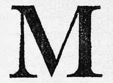
Returning to our original question ( What exactly is an em? ), consider this fact » Many languages, such as Chinese & Arabic, contain no letter 'M'. How do these browsers handle pages coded with em's?
What you'll find » the em (as used on the web) has nothing to do with the letter 'M'. Surprised? I was.
The em we use today (on the web) has a colorful history that originates in print typography .. which did indeed involve the letter M (capital, horizontal-length). You can look up this historical info yourself, if interested, but it's beyond my scope .. since it does not apply to web typography.
A brief aside » might be worth noting here that the technology associated with Print Typography has done much to benefit mankind. The implications cannot be over-estimated. Print typography led to printing presses .. which put books in the hands of ordinary folk .. like you & me .. so we too could say, "It is written," and learn cool things.
Along with the ability-to-read, print technology (which includes typography) has allowed civilization to climb out of the ignorance & superstition of the Dark Ages. But that's another discussion.
Here's another tidbit of Web Typography you need to know » All browsers come from the factory with a font-size default of 16-pixels. That's the starting point for all web designs, tho it's generally considered too big for most normal text uses.
At this starting point, 1em = 16-pixels, 2em = 32-pixels, 0.5em = 8 pixels. Etc. In this way, you can see that 1em = 100%, 2em = 200%, 0.25em = 25% and so on. It's really just basic math (multiplication) .. applied to sizes (lengths)..
CSS also makes available » KEYWORDS .. as an alternative method to setting font sizes. Keywords differ from ems in that they are NOT relative to the parent element. I use them on the home page. The text there is set to 'small,' while the headings are set to 'large.'
The downside of keywords is » they are not very precise. For example,small = 13 pixels. Medium = 16 pixels. Large = 19 pixels. (There are other keywords, both bigger & smaller..) These sizes work for me, but others may want more control .. for example » setting pixel sizes to 11, 12, 14, 15, 17 or 18.
The upside of keywords -- other than the fact that they are NOT relative to the parent element, and therefore simpler to use -- is that they allow a user to resize his text (.. unlike pixels in older versions of IE). Good usability.
CONCLUSION »  After reading enough about Web Typography to make my eyeballs fall out, I've come to the following conclusion (a simple strategy for controlling typography) » If keywords will work, I use them. If not, I use em's to tweak font-sizes (.. with pixel-level precision).
ONE LAST POINT » ems have nothing to do with the particular font used. Some fonts are bigger than others (for a given specified value). So specifying a different font will NOT change the pixel-value for a given length that is specified by/with ems. [ The ex unit, I believe, IS affected by variations in font sizing. ]
There are many other ways to specify lengths in CSS, but once you grok what an em is and how it works, the rest of web typography should be a piece-of-cake.
APPLICATION » So called "Elastic layouts" are based on em's. The blue-green sidebars on the home page are (each) set to 12 ems. This center column has a margin (left & right) of 2.4em .. which puts a little distance between the columns. By laying out a web page with ems, everything adapts to the font-size selected by a user.
RECAP » the EM (as used on the web) is a LENGTH, defined by a certain number of PIXELS .. more precisely, it's a relative unit of length, relative that is, to the vertical sizing applied to the parent element (16 pixels, by browser default).
Even tho the em's point-of-reference is a vertical length, it can be applied both vertically and horizontally .. which is one of the things that makes it so powerful.
EM's can be used anywhere a length is specified, tho many refrain from using them for padding, since padding is added to the width, creating an unknown actual width.
ONLY THING I'm not sure about is » What happens when you set an em value that corresponds to a fractional pixel value, such as 11.5 or 12.5 pixels? A monitor cannot display half a pixel, so I think it just rounds up or down (i.e. » 11.49 pixels gets rounded down to 11, while 11.51 gets rounded up to 12) .. tho not sure.
FUTURE STRATEGY » After older versions of IE are no longer in use ( a year or two from now), and users are free to resize text that has been specified by/with pixels, it would seem that ems will no longer be required to control typography. At that point, the use of ems will be limited to various length settings, such as column widths and margins. Shoot me a note if I'm missing something.
For more along these lines, here's a Google search preconfigured for the query » em css size font pixel web